Therapist Branding & Website Design
Storm’s End Counseling
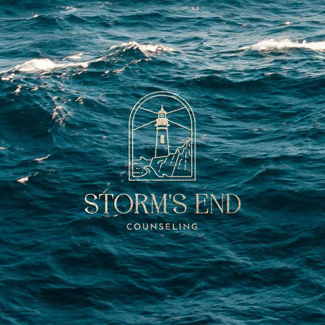
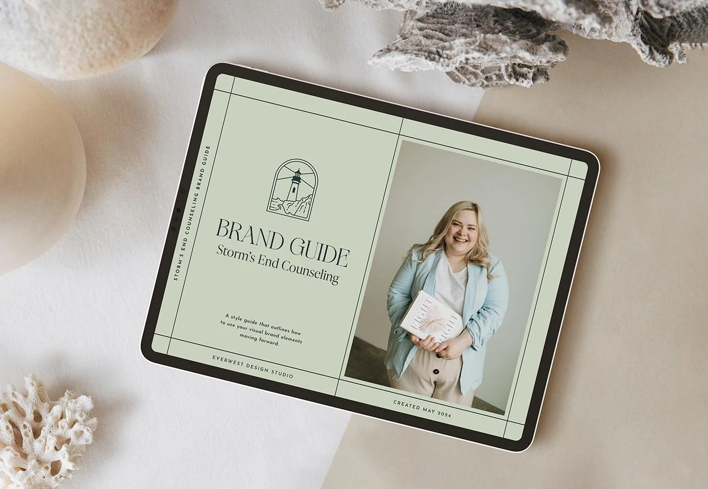
Storm’s End Counseling is a licensed marriage and family therapy practice based in Oregon, offering a safe, supportive space for individuals and couples to navigate life’s storms and find healing. To reflect this mission, we rebranded the visual identity with coastal motifs, a serene color palette, modern typography, and warm, inviting imagery that conveys a sense of hope and calm. The logo suite centers around a beautifully crafted lighthouse brand mark with a radiant beam of light, symbolizing guidance and light through life’s challenges—a meaningful representation of founding therapist Kiersten’s role with her clients. Once the core identity was established, we extended it to a cohesive, thoughtfully designed website.
Project Details
Storm’s End Counseling
-
After years of relying on a DIY brand and website design, the founder of Storm’s End knew that taking the next step toward growing her practice meant turning to a professional to elevate her brand and web presence. The creative direction for Storm’s End Counseling centers on capturing a sense of calm, hope, and resilience. Inspired by the symbolism of weathering life’s storms, the visual identity blends coastal elements with modern, approachable design. The goal was to create a brand that feels both professional and deeply personal—conveying trust, warmth, and guidance through thoughtful design choices.
-
The Storm’s End logo suite is anchored by a lighthouse brand mark, symbolizing hope, guidance, and resilience in navigating life’s storms. The lighthouse emits a radiant beam of light, reinforcing the brand’s core message of support and clarity during difficult times. The primary logo features a clean, modern wordmark paired with the lighthouse, while secondary variations offer flexibility for different applications. The suite also includes a minimalist monogram logo for social media and smaller uses, ensuring a cohesive brand presence across all touchpoints.
-
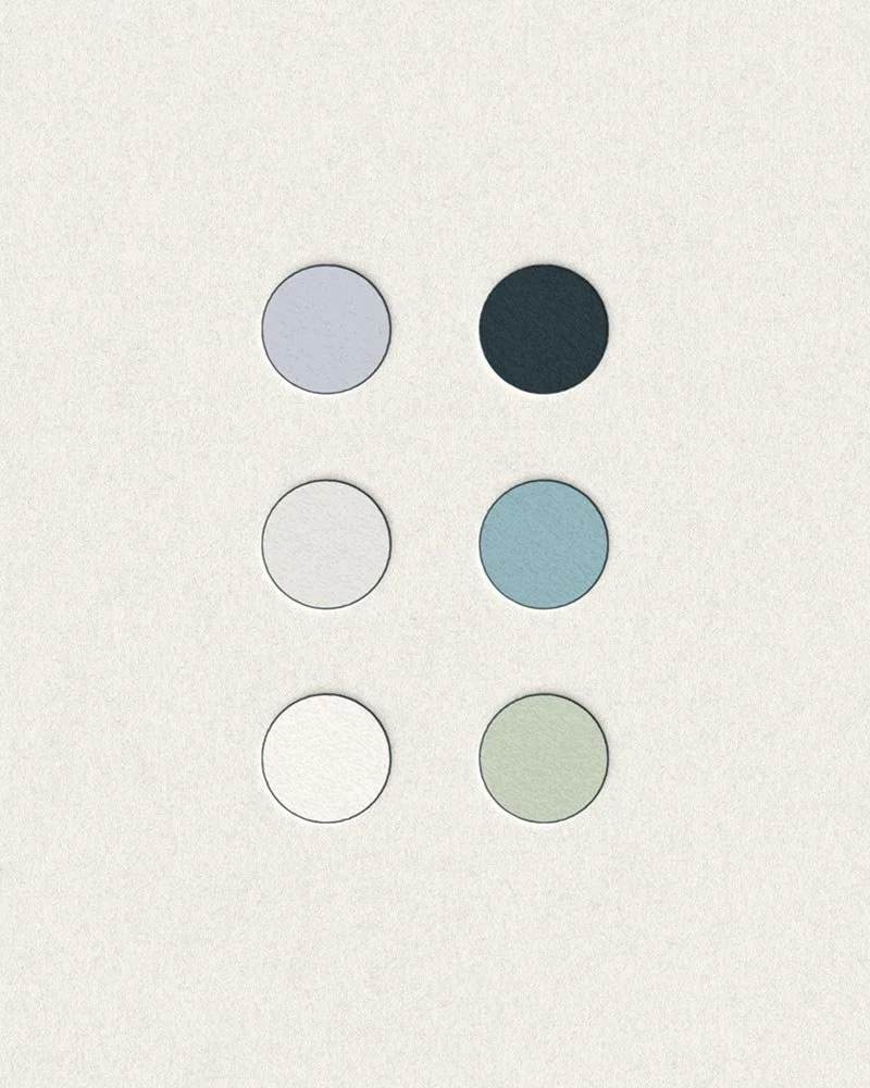
The color palette is inspired by Oregon’s coastal landscape, featuring soft blues, muted greens, sandy neutrals and an unexpected addition of lavender to evoke a sense of calm, grounding, and renewal. These tones reflect the soothing environment Kiersten strives to create for her clients.Typography choices include a delicate, serif typeface paired with a clean, modern sans-serif for balance. The serif adds a sense of warmth and trust, while the sans-serif keeps the overall look fresh, approachable, and timeless. Together, they convey professionalism with a personal, human touch.
-
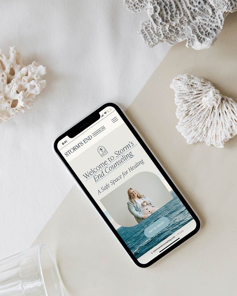
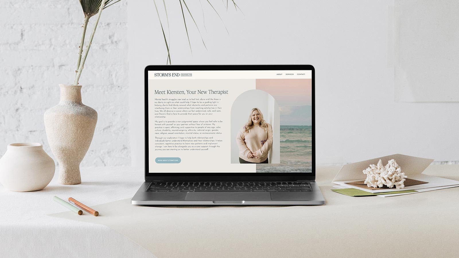
The Storm’s End website brings the brand to life with an inviting, user-friendly design that emphasizes warmth and trust. Coastal imagery and soft colors create a calming atmosphere, while thoughtful layouts guide visitors through services and resources with ease. The website is optimized for both desktop and mobile, ensuring a seamless experience across devices. Subtle animations and interactive elements add a modern, polished touch, reinforcing the brand’s message of guidance and support in a gentle, welcoming way.
A Note from the Client
“Working with Farrah at Everwest Design was more than I could have hoped. I felt from the very start I knew exactly what the plan would be and how everything would flow. I had such a specific vision heading into this project for my counseling business and was worried about being able to bring it to life, but Farrah was able to bring the vision to life better than I could have ever hoped. I cannot recommend her enough!”
— Kiersten, Storm’s End Counseling —