Cosmetic Dentistry Branding Design
Blanco Teeth Whitening Studio
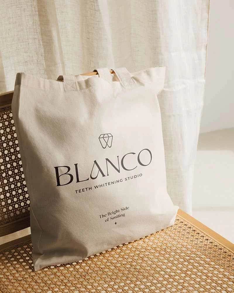
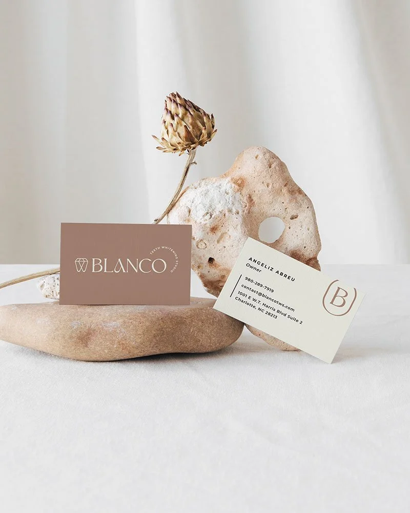
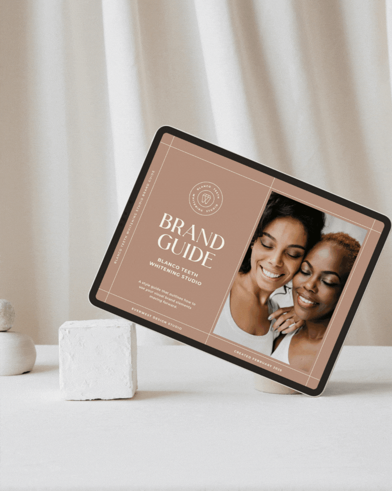
BLANCO Teeth Whitening Studio, based in Charlotte North Carolina, delivers a luxury experience through teeth whitening, tooth gems, and personalized training—with a mission to brighten smiles and boost confidence. To support this bold new venture, we developed a comprehensive visual brand identity that positions BLANCO as both professional and approachable. From strategy to execution, the brand was designed to resonate with a modern audience and stand out in the competitive dentistry space. A key highlight is the custom logo suite, where a diamond-tooth icon cleverly ties together themes of brilliance, strength, and style—perfectly capturing the brand’s promise.
Project Details
Blanco Teeth Whitening Studio
-
The creative direction for BLANCO was all about delivering a luxury experience with a soft, modern edge. Designed to feel warm, confident, and uplifting, the visual identity balances high-end elegance with an approachable tone—perfectly aligned with BLANCO’s mission to brighten smiles and boost confidence. Every brand element was crafted to resonate with a style-conscious audience looking for both expertise and aesthetic appeal in their beauty and wellness journey.
-
At the heart of the visual identity is a custom logo suite that seamlessly blends symbolism and sophistication. The hero icon—a diamond cleverly shaped into a tooth—captures BLANCO’s core offerings with subtle brilliance. Representing strength, beauty, and radiance, it offers a visual nod to both teeth whitening and tooth gems. Paired with a sleek, modern wordmark, the full logo suite is versatile, refined, and instantly recognizable across platforms.
-
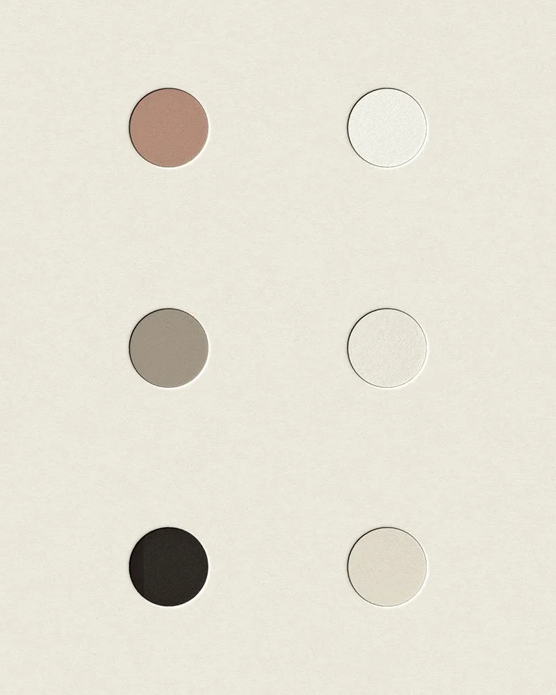
BLANCO’s visual identity is anchored by a soft, neutral color palette, designed to evoke calm, clarity, and refinement. A subtle pop of mauve adds a signature touch—feminine, modern, and memorable—helping the brand stand out while maintaining an elevated feel. This refined palette is paired with a sleek, contemporary type system that balances elegance with readability. Clean lines and modern letterforms enhance the brand’s polished aesthetic, ensuring consistency and sophistication across every touchpoint. Together, these elements create a cohesive, high-end look that feels both professional and approachable.