Natural foods market Branding
Farewell Market
Farewell Market is a natural foods store located on Bend’s Southwest side, rooted in the belief that food should nourish both people and planet. With a deep commitment to product standards that prioritize human and environmental health, Farewell Market honors the farmers, innovators, and knowledge keepers who have long advocated for thoughtful change in the way we grow, source, and enjoy our food. The brand’s visual identity was designed to reflect that mission—warm, grounded, and deeply authentic, with a sense of modern agrarian simplicity.
Project Details
Farewell Market
-
Farewell Market’s creative direction centered on creating a brand that feels place-based, welcoming, and intentional. The goal was to balance artisanal warmth with refined clarity, capturing both the heart of a neighborhood market and the elevated standards behind every product on its shelves.
The resulting identity feels rooted in Central Oregon—natural, thoughtful, welcoming and quietly timeless.
-
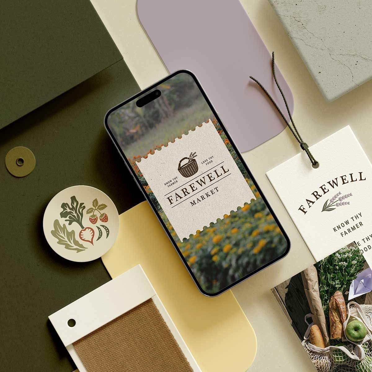
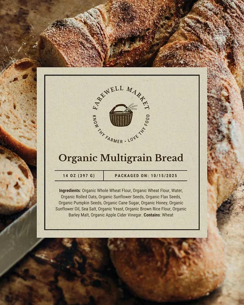
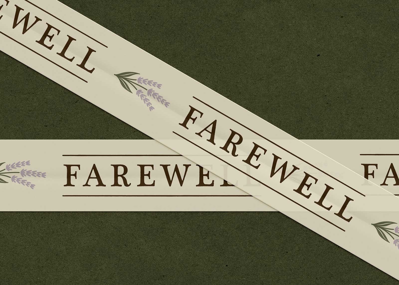
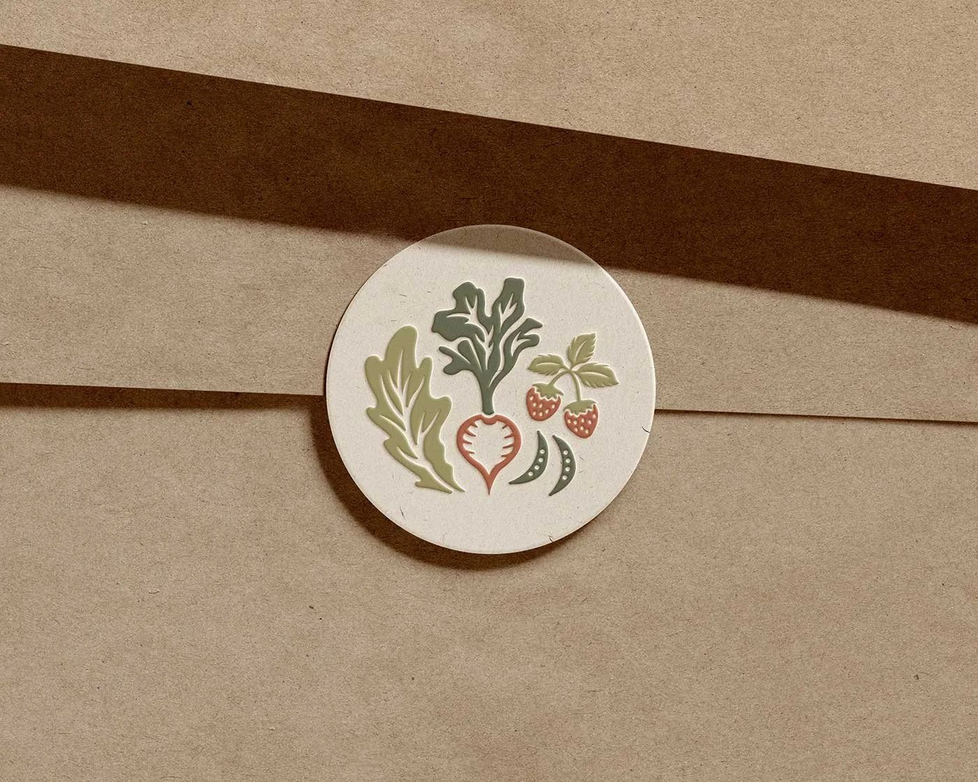
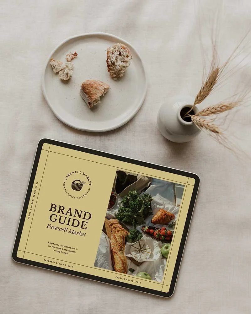
The primary logo strikes a balance between handcrafted character and modern simplicity, featuring a harvest basket and lavender illustration with subtle, organic detailing. Paired with a strong, enduring wordmark and framed by elegant structural elements, the logo system feels both approachable and refined.
Together, the suite creates a versatile identity that feels grounded, honest, and distinctly Farewell Market.
-
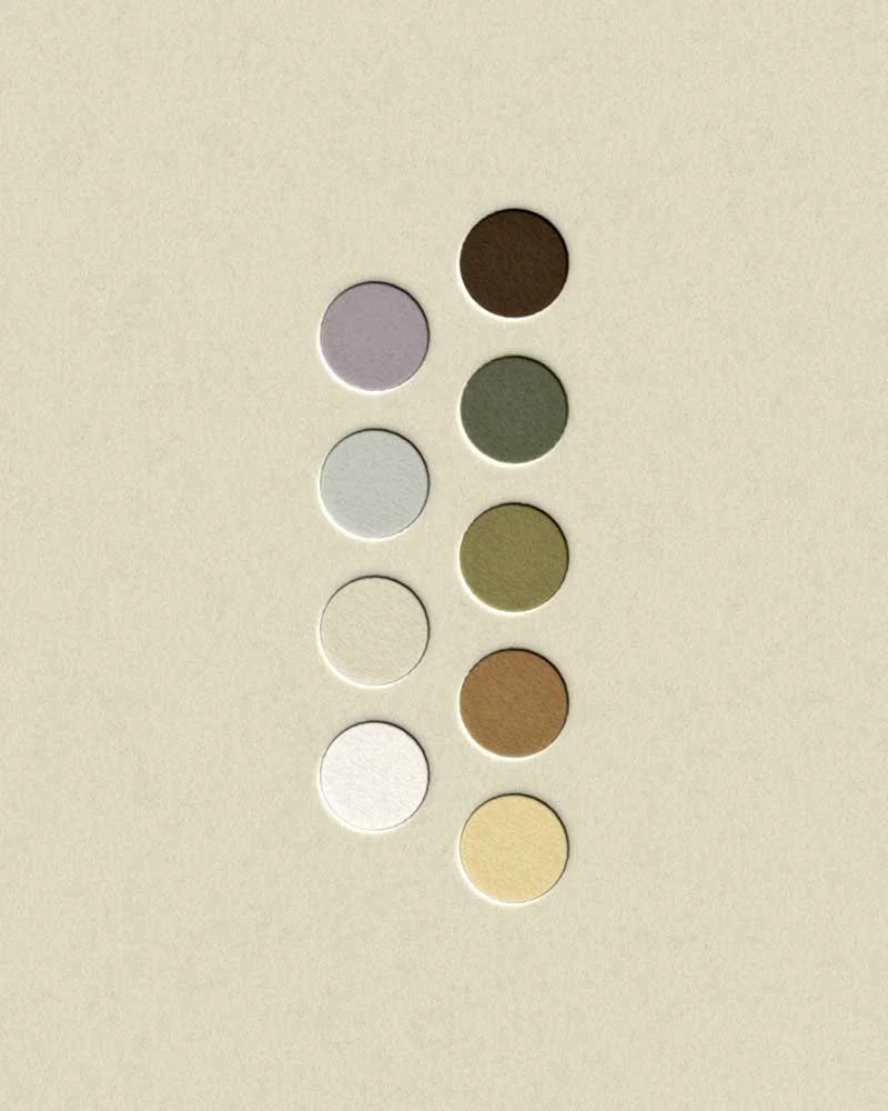
Inspired by the surrounding landscape, Farewell Market’s color palette blends rich earth tones with soft pastels, creating a warm, welcoming atmosphere that feels harmonious and naturally at home in Bend.
A refined typography system with clear hierarchy brings a modern edge to the brand, ensuring the identity feels both elevated and accessible across packaging, signage, and digital touchpoints.
A Note from the Client
“I just finished reviewing all of the files that you sent over and I wanted to take the time to tell you how pleased I truly am with the work that you have done. The way in which you were able to capture every vision, idea, ambition, and mood we wanted to create in our branding is inspiring. As I scrolled through the various stock images, the bread [label], the core and secondary logo variations, and every file type and explanation you crafted for our understanding, I was touched by the level of detail you went to delivering everything promised and so much more. You have been the perfect balance of professional and personable to work with during the entire process, and I could not be more excited to take the branding package you have created and put it to work in our store!
Thank you so much for all of the work that you put into this and for being a lovely human to work with. I am sure we will be in touch to provide you with updates as we move along in the process of getting the store open.”
— Senna, Farewell Market —