Interior Designer Branding & Website Design
Peyton Elizabeth Designs
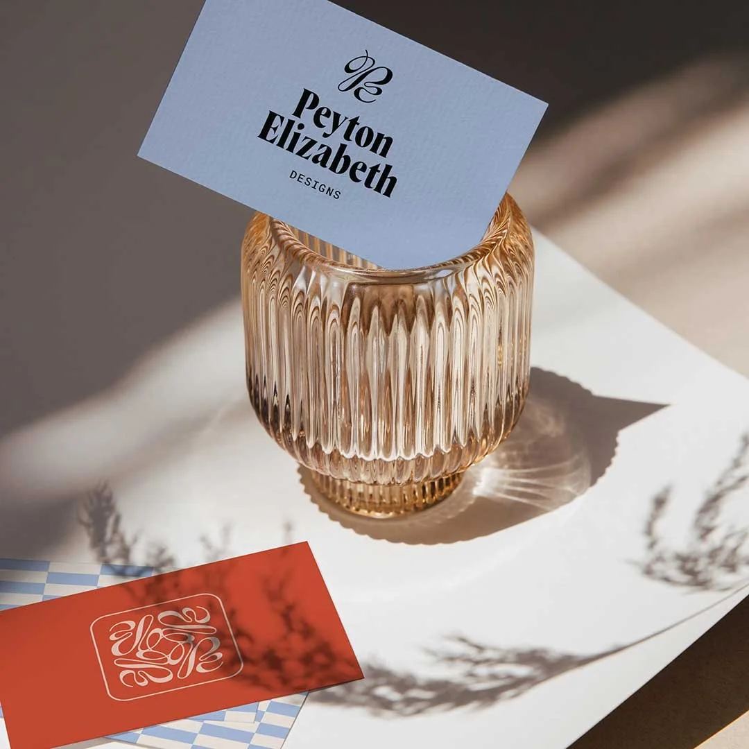
Peyton Elizabeth Designs is an interior design studio proudly offering a bespoke design experience to the greater Pacific Northwest area. To attract more high-profile clients, Peyton and her team felt a rebrand was in order. We created a brand identity and web experience to help them stand out in a crowded market featuring vibrant colors and patterns and a sophisticated, yet unexpected logo suite.
Project Details
Peyton Elizabeth Designs
-
Since 2017, the founder of Peyton Elizabeth Designs was DIY-ing her branding and website design and not seeing the results and client leads she desired. She chose to partner with Everwest Design Studio to transform her interior design business’ visual brand identity and website in order to start attracting and landing higher-profile clients and projects. To help her accomplish this goal, we created a one-of-a-kind aesthetic that is bold, eye-catching, and modern with a hint of design flare inspired by the 1970s. After we developed her strategically designed brand, we then brought her web presence to life to wow potential clients.
-
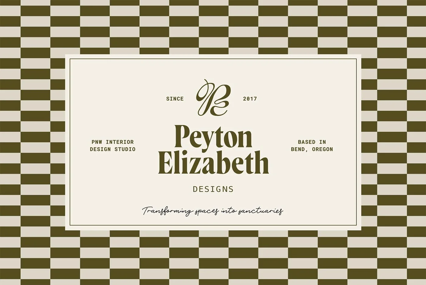
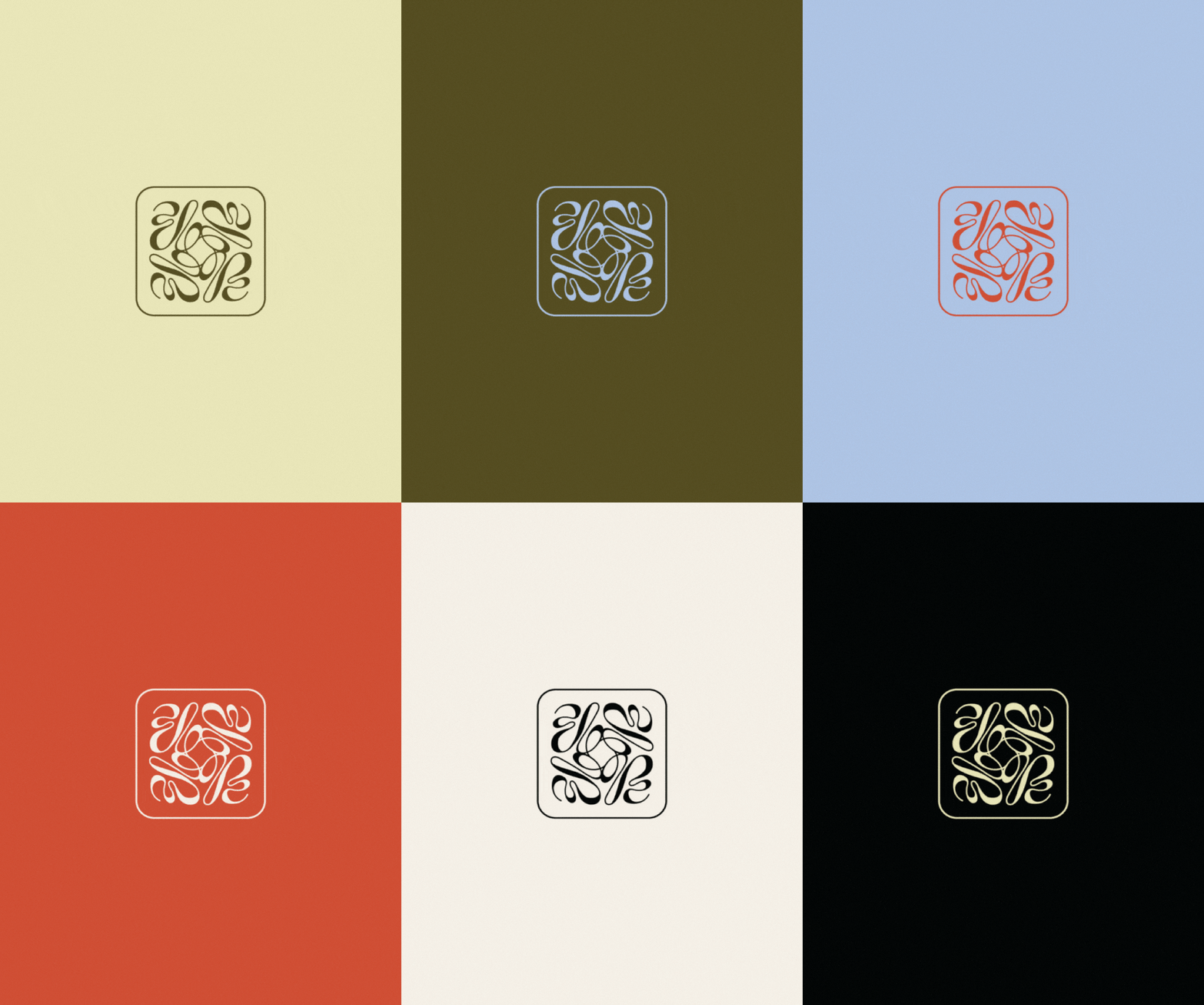
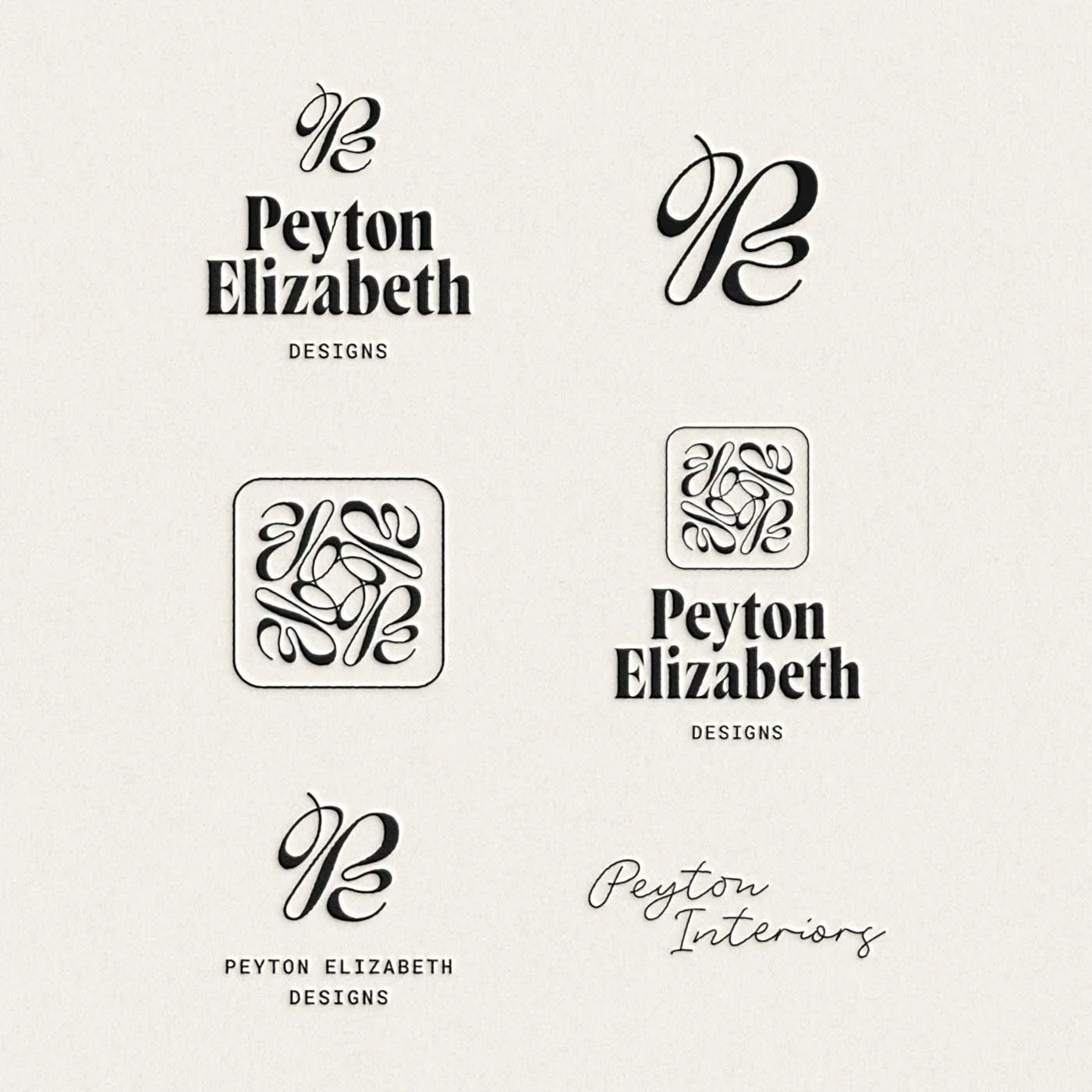
The fully custom logo suite for Peyton Elizabeth Designs features an abstract monogram displaying the founders initials. You’ll noticed this monogram is cleverly repeated in an elegant brand stamp contained within a geometric shape outline. These elements are complimented by a bold serif font with sharp contrast to the line weight of the letterforms. This logo suite includes a primary logo, secondary logo variations, primary wordmark, signature-style subbrand wordmark, brand stamp and brand icon.
-
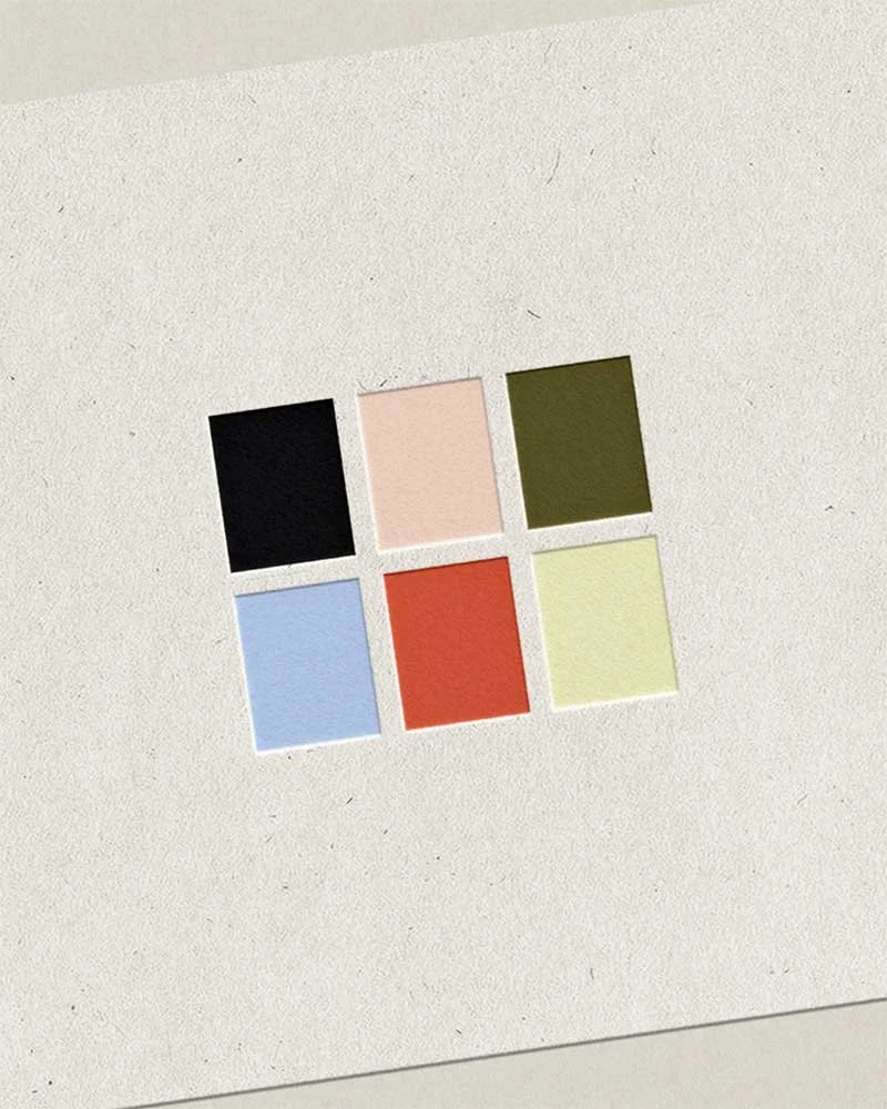
Interior Design Studios are often lost in a sea of stark black and white when it comes to their branding and website visuals. That’s not what we wanted for Peyton Elizabeth Designs. Peyton wanted to ensure her branding stood out from the crowd and conveyed the level of creativity she brings to the table. So, we created a vibrant, eye-catching color palette with a variety of colors that could be used all together, or separately for a quieter, monochromatic color system when appropriate.
Typefaces used: Wayfinder by Connary Fagen, Roboto Mono by Christian Robertson, Rose Garden Deluxe by by Emil Karl Bertell and Fenotype.
-
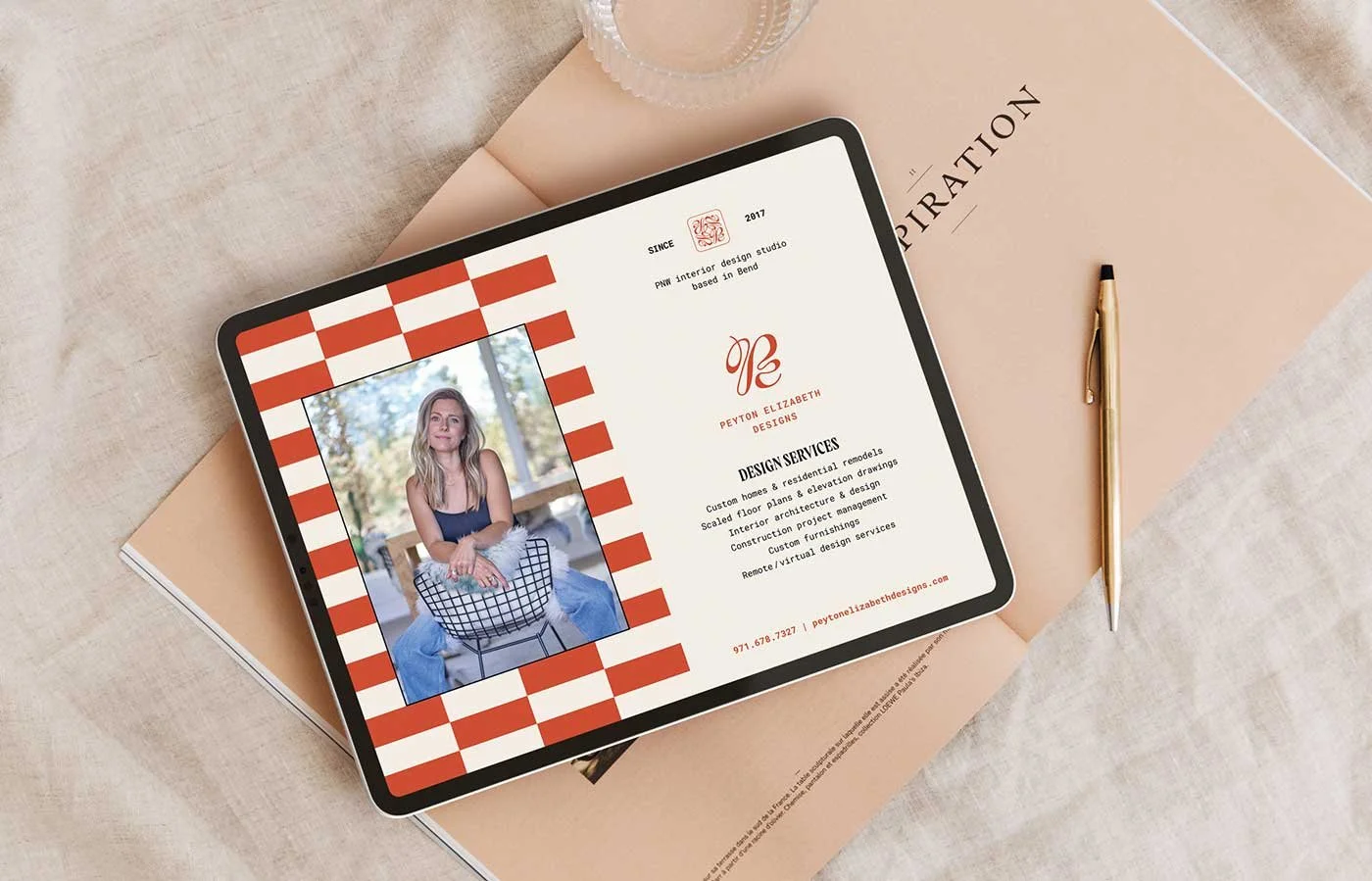
The horizontal check pattern developed for Peyton Elizabeth Designs is modern, stylish, cool and adds a little drama to their branding. This pattern can be used for things like backgrounds, framing elements, social media graphics and as a textural element in print marketing materials to add visual interest and create a signature branded look.
-
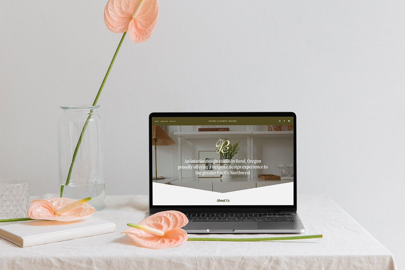
The website for Peyton Elizabeth Designs lives large with the look and flow of a 4-page website upon entry, but the links in the navigation actually anchor to specific sections all within the same page. Pretty cool, right?
If you are a service-based business owner with a limited budget, but still want to wow potential clients and collaborators with a standout, one-of-a-kind web experience, then this might be the perfect solution for you. The beauty of starting small is that you can always add more web pages to your site later as your business grows and your services expand. Let’s make a website that suits your goals and needs now and will propel your business forward.
A Note from the Client
“I recently had the pleasure of working with Farrah, a highly talented Branding Designer at Everwest Design Studio, and I am thrilled to share my positive experience. From start to finish, Farrah demonstrated a level of professionalism and creativity that exceeded my expectations.
First and foremost, Farrah took the time to truly understand the essence of my brand. She asked insightful questions and actively listened to my vision, ensuring that every aspect of the design reflected the core values and personality of my business. This attention to detail and commitment to understanding my needs set the foundation for a successful collaboration.
Farrah's creative prowess is truly remarkable. She translated my ideas into visually stunning concepts that perfectly captured the identity I wanted for my brand. Her ability to blend artistic flair with strategic thinking was evident in every design element, from the color palette to the typography. The result was a cohesive and compelling brand identity that stands out in a crowded market.
Communication throughout the process was seamless. Farrah was responsive, open to feedback, and quick to make adjustments. Her collaborative approach made me feel like a valued part of the creative process, and I appreciated how she translated my feedback into refined designs that exceeded my expectations.
Moreover, the level of professionalism demonstrated by Farrah was commendable. Timelines were adhered to, and the final deliverables were of the highest quality. It's clear that Farrah takes great pride in her work, and her dedication to delivering exceptional results was evident in every aspect of the project.
In conclusion, working with Farrah at Everwest Design Studio was an absolute pleasure. I now have a brand identity that not only meets but surpasses my expectations. If you're seeking a Branding Designer who combines creativity, professionalism, and a genuine passion for their craft, I highly recommend Farrah and Everwest Design Studio. I look forward to future collaborations and the continued success of my reimagined brand.”
— Peyton, Peyton Elizabeth Designs —
