BLANCO Teeth Whitening Studio

Brand Identity Design

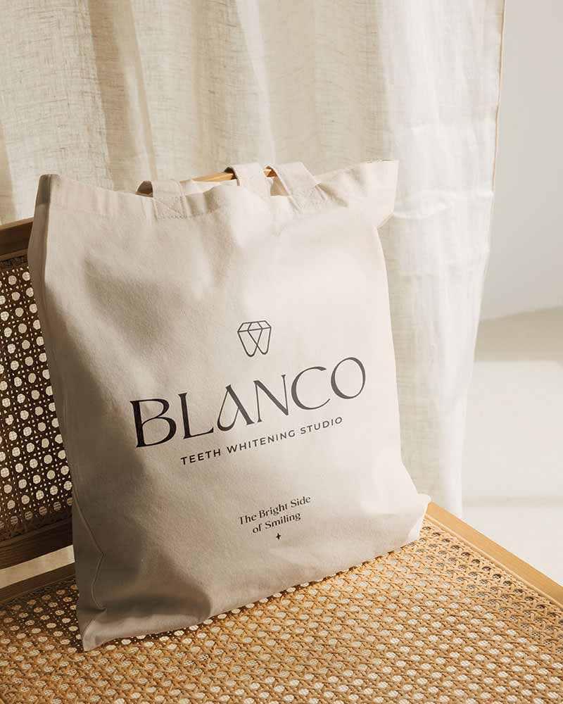
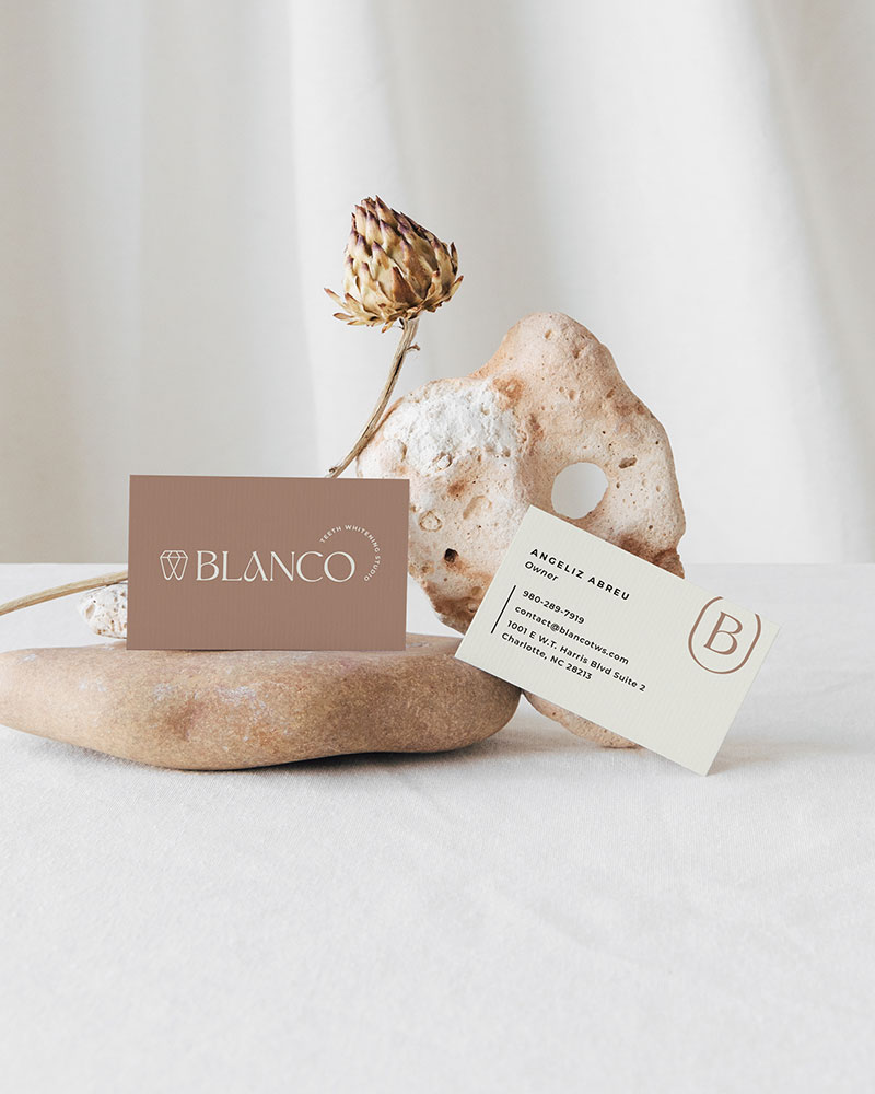
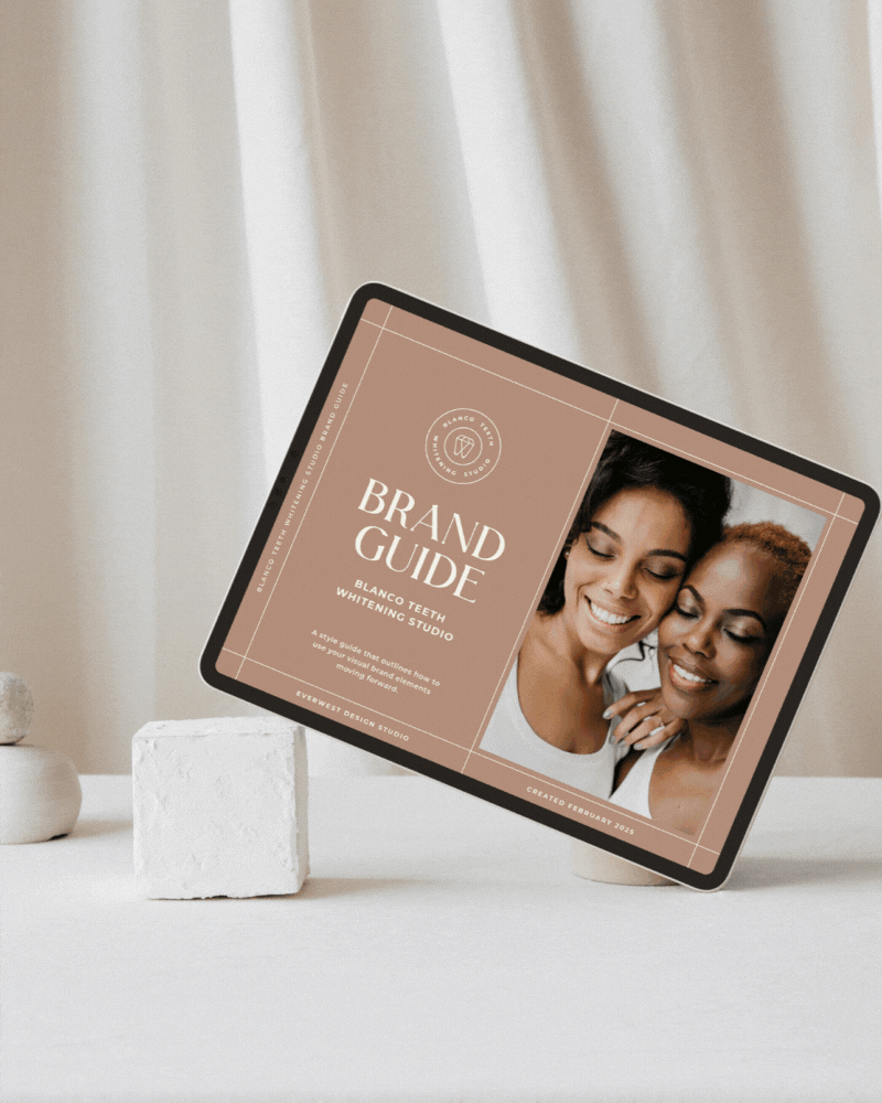
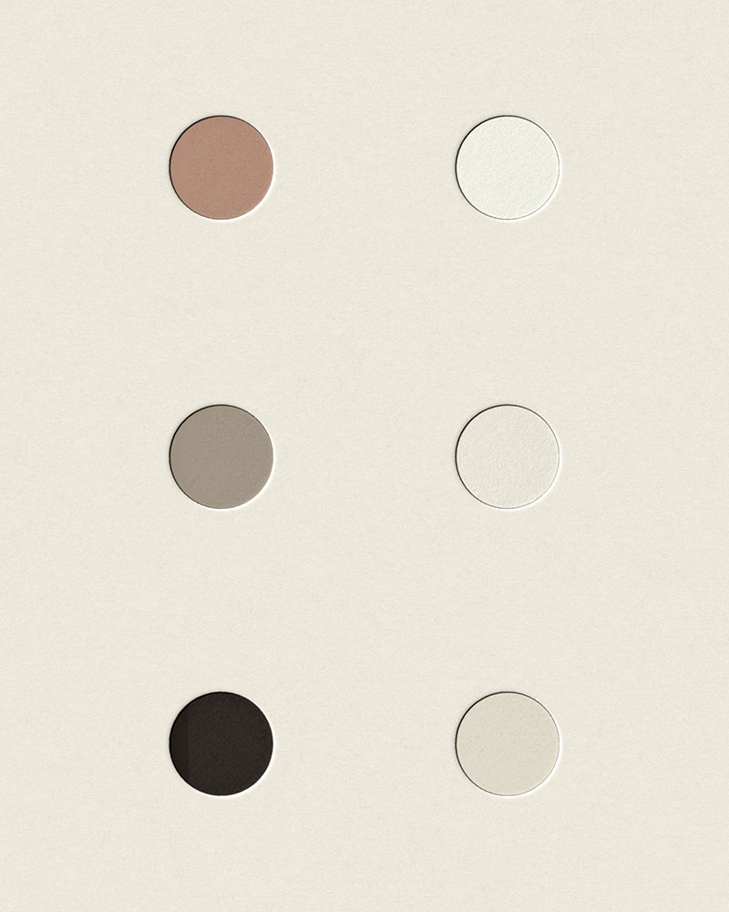
BLANCO Teeth Whitening Studio, based in Charlotte North Carolina, delivers a luxury experience through teeth whitening, tooth gems, and personalized training—with a mission to brighten smiles and boost confidence. To support this bold new venture, we developed a comprehensive visual brand identity that positions BLANCO as both professional and approachable. From strategy to execution, the brand was designed to resonate with a modern audience and stand out in the competitive dentistry space. A key highlight is the custom logo suite, where a diamond-tooth icon cleverly ties together themes of brilliance, strength, and style—perfectly capturing the brand’s promise.

Blanco Teeth Whitening Studio Beauty Dental Branding Business Card Design
Logo Suite Design Variations for Blanco Teeth Whitening Studio
Blanco Teeth Whitening Studio Dental Office Sign Design
Blanco Teeth Whitening Studio Beauty Brand Letter B Monogram Logo Design
Dental Beauty Brand Mauve Neutral Color Palette

Project Details

Blanco Teeth Whitening Studio

The creative direction for BLANCO was all about delivering a luxury experience with a soft, modern edge. Designed to feel warm, confident, and uplifting, the visual identity balances high-end elegance with an approachable tone—perfectly aligned with BLANCO’s mission to brighten smiles and boost confidence. Every brand element was crafted to resonate with a style-conscious audience looking for both expertise and aesthetic appeal in their beauty and wellness journey.

At the heart of the visual identity is a custom logo suite that seamlessly blends symbolism and sophistication. The hero icon—a diamond cleverly shaped into a tooth—captures BLANCO’s core offerings with subtle brilliance. Representing strength, beauty, and radiance, it offers a visual nod to both teeth whitening and tooth gems. Paired with a sleek, modern wordmark, the full logo suite is versatile, refined, and instantly recognizable across platforms.

BLANCO’s visual identity is anchored by a soft, neutral color palette, designed to evoke calm, clarity, and refinement. A subtle pop of mauve adds a signature touch—feminine, modern, and memorable—helping the brand stand out while maintaining an elevated feel. This refined palette is paired with a sleek, contemporary type system that balances elegance with readability. Clean lines and modern letterforms enhance the brand’s polished aesthetic, ensuring consistency and sophistication across every touchpoint. Together, these elements create a cohesive, high-end look that feels both professional and approachable.